Custom Search
|
|
 
|
||
|
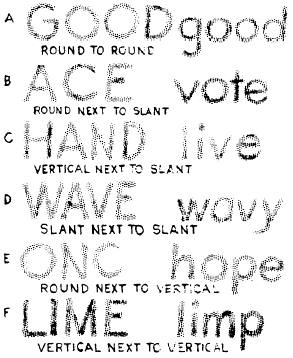
COMPOSITION OF LETTERING Once you have learned the proper shapes and strokes required to form each letter and numeral, you should concentrate on practicing the composition of words and sentences. Proper spacing of letters and words does more for the appearance of a block of lettering than the forms of the letters themselves. But this does not mean that you should discontinue further practice of correctly forming each letter.LETTERSPACING In straight-line lettering, determine the spacing between letters by eye after making the first letter and before making each succeeding letter. To give a word the appearance of having uniformly spaced letters, make the areas between the letters nearly equal, as shown in figure 3-54. The areas between adjacent letters in a word vary with respect to whether the letters have straight sides (H, I, M, N) or slanted sides (A, V, W) and whether the letters are round (O, Q, C, G) or open (L, J). Adjacent straight-sided letters are drawn farther apart than are adjacent round letters. Adjacent slant-sided and open letters are drawn nearer together than are adjacent round letters. Where letters L and T, L and V, A and V, and other pairs of like shape come together in a word, the top of one may have to be drawn above the bottom of the other to avoid having the word appear as two or more words. In letterspacing, the six problems listed below are the hardest to solve. The first five problems are solved by moving the letters closer together; the sixth by moving the letters farther apart.1. Round next to round. (Increasing area at top and bottom where letters curve away from each other, as in figure 3-55A).2. Round next to slant. (Increasing area at top or bottom where letters move away from each other, as in figure 3-55B).3. Vertical next to slant. (Increasing area at top or bottom where one letter slants away from the other, as in figure 3-55C).4. Slant next to slant. (Increasing area at top or bottom where letters slant in opposite directions, as in figure 3-55D).5. Round next to vertical. (Increasing area at top and bottom where round letter curves away, as in figure 3-55E).6. Vertical next to vertical. (Decreasing area at top and bottom where stems move together, as in figure 3-55F.)A good way to evaluate the spacing of letters is to hold the lettering away from you and squint your eyes, observing the gray tone throughout the
Figure 3-55.-Common spacing problems. lettering. If the tone appears spotty or varies too much, the letters are poorly spaced. |
 
|
|
|
||