Custom Search
|
|
 
|
||
|
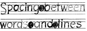
WORD SPACING Proper spacing between words is an important factor in making them easy to read. Allow enough space between words and sentences to keep them from running together, but not so much as to cause words to be read one at a time. A good practice to follow is making spaces between words equal to the space that the letter O occupies as shown in figure 3-56. If you prefer, you can use the letter N or a correctly spaced letter I instead. Naturally, the design of the last letter of a word and of the first letter of the following word must be considered in determining the amount of space you leave between words. You should leave a space equal to a capital O between two full-height straight-stemmed letters, such as H and E or D and B. Of course, if one or both of the letters are curved, the space should be appropri-ately reduced. If the two letters involved are lowercase, use the lowercase o to determine the width of the space. If one letter is full height and the other is lowercase height, such as the words bid now or on him, the space would be equal to half a capital O and half a lowercase o.In addition to the spacing between letters and words, the spacing between lines of lettering adds to the readability of the lettering. Again your eye and your artistic ability must be your guide. Except when you are trying for a special effect, you should have enough space between the lines to make it easy for the reader to see what he is reading.The distance between lines may vary from 1/2 to 1 1/2 times the height of the letter, but for the sake of appearance, it should not be exactly
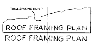
Figure 3-56.-Spacing between words and lines. the same as the letter height. As a general rule, two thirds of the letter height is a good distance between lines. This spacing allows room for descenders of lowercase letters and still maintains a clear space of one third of the letter height between the descenders and capital letters, or ascenders of lowercase letters of the following line. Figure 3-56 shows proper word and line spacing.CENTERING Since the letters of the alphabet vary in width, it is rather difficult to center a line of lettering. Figure 3-57 shows one way of solving this problem. First, take a piece of scratch paper and letter in the required line. Then, place this lettering above the area in which your lettering is to go and center it. Finally, use the sample as a guide to lettering the desired line.Ending a line of lettering at a given point is equally difficult. As in centering, first, letter the line on a piece of scratch paper in order to achieve the proper line length.To make lines of lettering come out to a specified length, you must adjust the word and/or letterspacing. This adjustment in spacing is called JUSTIFYING. A good example of justifying is found in the columns of this manual. Notice how all full lines start and stop on the right- and left-hand margins. Usually, you will only find justified lettering typeset or typewritten by mechanical means. However, if you do have an occasion to justify your lettering, you should try to keep the spacing between the words as uniform as possible. Uneven spacing detracts from the appearance of the job. When it is impossible
Figure 3-57.-Centering with trial spacing paper. to divide the spacing evenly, insert wider spacing at points where one word ends and the next begins with tall letters, like d, b, and l.If you use too much space between the words, the paragraph will tend to fall apart because it is filled with rivers of white space that will disturb the eye.When a line is so short that it calls for an undue amount of space between words to lengthen the line, allow more space between the letters in each word. This is known as letterspacing. When words are letterspaced, always allow extra space between words so that they will not seem to run together when they are read.Letterspacing makes short words in titles or headings appear longer. Though it frequently improves the appearance of words in caps, letter-spacing reduces the legibility of words in lowercase, Therefore, the process must be used with caution. |
||
|
||