Custom Search
|
|
 
|
||
|
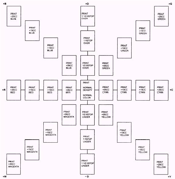
When making color prints, you must always obtain the proper print density before you evaluate the color balance. Several ways are used to judge test prints. Before test prints are viewed, however, there are some lighting factors to be considered. Viewing Conditions The color quality of the viewing light source strongly influences the apparent color balance of the print. Ideally, the light in the evaluation area should be the same color quality and intensity as the light under which the final print is to be viewed. From a practical standpoint, some average conditions are used. Several factors are important in specifying light sources for viewing color prints. These are intensity, color temperature, and color rendering index. The intensity of the light source influences the amount of detail that can be seen in a print. For good viewing, a light source should provide an illuminance of 1400 lux
Figure 12-4. Ring around. 590 lux (130 footcandles 55 footcandles). The color temperature of the light source should be between 3800 K and 5000 K. The most important characteristic of the light source is the color rendering index (CRI). The CRI is a scale from 0 to 100 and is used to describe the visual effect of a light source on eight standard pastel colors. For good color rendering in the prints being viewed, the CRI of the light source should be between 85 and 100. Fluorescent tubes, such as the Westinghouse Living White or the Deluxe Cool White tubes (made by several manufacturers), have at least a CRI of 85 and a color temperature near 4000 K. Satisfactory results also can be obtained by using a mixture of incandescent and fluorescent light. For each pair of 40-watt Deluxe Cool White fluorescent tubes, a 75-watt frosted tungsten bulb should be used. Ring Around Comparing the test print to a series of prints that vary from a standard print (correct density and color balance) in known amounts is a simple method of determining color and density correction (fig. 12-4). Comparing your test print to a ring around is particularly helpful when your test print is far from being correct. When using a ring around, you should match the test print as closely as possible to one of the prints. The amount and color of filtration you should add or subtract from the filter pack are the same as indicated on the ring around. When the test print is reasonably close to being correct, you can predict the final exposure conditions accurately. Once again, remember how exposure affects the three dye layers of the paper. That will simplify the choice of selecting the correct filtration. Color Printing Viewing Filters When a test print is reasonably close to the desired color balance, viewing it through color printing viewing filters helps to determine what color change is needed. Color printing viewing filters come in six filter colors: red, green, blue, cyan, magenta, and yellow. Each color is represented in 10, 20, and 40 density values. To use a filter, hold it several feet away from the print and light source. Quickly flick the filter in and out of your line of vision to see the color correction the filter makes. Since these filters tend to overcorrect the highlights and undercorrect the shadows, you should view the lighter middle tones through the filters to determine the desired color balance. Try several filters of different values and colors when evaluating a test print; for example, when the print looks cold to you, evaluate it through a series of red, magenta, and yellow filters to determine whether the color in excess is cyan, green, or blue. Similarly, viewing a warm print through cyan, green, and blue filters will determine whether the color in excess is red, magenta, or yellow. Since the contrast of print materials is fairly high, a filter used in exposing a print tends to produce a greater change in color balance than the visual effect of viewing a print through a filter. In general, the filtration change to the filter pack should be one half of the viewing filter that makes the lighter middle tones of the test print appear correct; for example, you have determined that when viewing a test print through a 20CC green filter, the color balance looks correct; therefore, you would make a 10CC change to your filter pack Suppose, again, that the test print is too blue; that is, not enough yellow dye was produced. The print will look best through a 10CC yellow filter. Since blue light creates yellow dyes, we must increase the amount of blue light reaching the paper by 05CC. You should do this by subtracting 05CC of yellow filtration (for subtractive printing) or subtracting 05CC of blue filtration (for additive printing). When a 20M filter is best for viewing, subtract 10CC G (additive printer) or 10M (subtractive printer) from the pack to produce the desired correction. |
 |
|
|
||