Custom Search
|
|
 
|
||
|
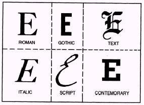
TYPOGRAPHY Typography is the art of printing with type. It involves the style, arrangement and appearance of the printed page. As editor of a ship or station newspaper, you should be familiar with a few important type-related terms. Printers' Measurements Type size is measured in points. One point is approximately one seventy-second of an inch. Twelve points equal one pica (remember - six picas equal one inch). Points are used to measure the height of a letter of type. The width of a line of type is given in picas. Most newspaper columns are about 12 picas (2 inches) wide. Type ranges in size from 3 to 120 points. Your stories will usually be printed in 8- or 10-point type. Most of your headlines will range from 12 to 36 points. The depth of a column of type or art (measured down the page) is given in inches. A column inch is one column wide and 1 inch deep; a photograph two columns wide and 3 inches deep occupies six column inches. Type Classification Did you ever stop to think how many different kinds of handwriting you come across in a single day? Some are large and bold, some are weak, some small, some clear and some are almost illegible. Type styles, called typefaces, are much the same. The first concern of selecting a type is, of course, clarity. Type must be legible. However, there is more to it than that. Like handwriting, typefaces reflect certain characteristics, such as refinement, dignity, boldness or strength. Properly used, they can convey the feeling or mood of a message. They maybe warm, brisk, dignified, modern or old-fashioned - whatever is needed to emphasize or suggest the thoughts expressed in copy. Type can be used to attract the reader's attention. The use of large boldfaces is one of the most effective ways of stopping the eye. Large, boldface type, however, is difficult to read. It should be limited to a few words and should be followed by smaller, more legible faces that invite reading. Most kinds of type have both capitals and small letters. Publishers use the term uppercase for capitals and lowercase for small letters. These terms originated in early printshops where type was set by hand. The less-used capital letters were stored in an upper storage. case and the frequently-used small letters in a lower one. As early as the seventeenth century, publishers knew they had to organize their typefaces efficiently. They arranged their typefaces into main type classes. The six main classes of type (fig. 8-15) areas follows: . Roman o Gothic l Text . Italics l script l Contemporary
Figure 8-15. - The six main classes of type. ROMAN. - Roman is the type most commonly used for the text of magazines, newspapers and books. It is chosen because most readers are familiar with it and Because it is the easiest to read in smaller sizes and in lengthy articles. Roman types are divided into two classifications: modern and old style. The chief difference between modern and old style reman is found in the serifs (the small cross strokes at the ends of the main lines of a letter). The old style letter has soft, rounded serifs, while the modern letter has heavier shadings and thin, clean-cut hairlines. GOTHIC. - Study the difference between the reman letter and the gothic letter in figure 8-15. You will notice that where the reman letter is composed of a series of thick and thin lines, the gothic letter is constructed of lines of even weight. It has no serifs (known in the printing profession as "saris serif"); it is perfectly plain. Gothic type is popular for use on posters and as headlines. TEXT. - Text type is sometimes referred to as "Old English." Text was the first type style used in the history of printing. Although it is still used frequently, it is generally limited to a few lines of copy. As far as newspaper work is concerned, it should be limited to something formal, such as religious announcements, prayers, programs and invitations. ITALIC. - In italic type, the letters are slanted and made to match almost every reman, gothic and contemporary type style in use today. Italic is used in text matter to show emphasis. Although italic was originally used for text, it was rather hard to read in lengthy articles and it is seldom used for this purpose today. SCRIPT. - Script typefaces have little connecting links, or kerns, that combine the letters and give them the appearance of handwriting. Script is suitable for announcements and invitations. CONTEMPORARY. - The past 50 years have been highly significant in typographic history. The old gothics have had their faces lifted, and new streamlined faces have appeared everywhere. Contemporary type refers to the thousands of modern, artistic faces used in a variety of ways, such as advertisements, labels on cans and boxes, display composition and television commercials. The example of contemporary type shown in figure 8-15 is bold (heavy block), but the same group contains lightface letters. In general, modern types feature more lightface than bold.
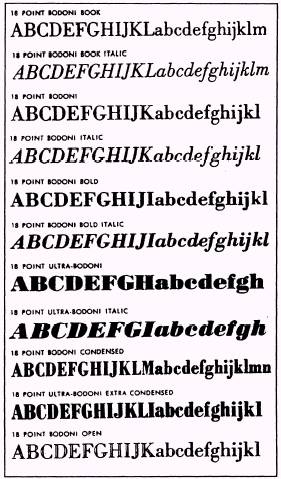
Figure 8-16. - Various typefaces in the Bodoni family. Type Families From classes, type is further categorized into typefaces that are similar in design, though not exactly alike. These groups are called type families. Each type family has a name and a certain basic family resemblance. Many type families are named for their creators, such as Bodoni and Goudy. Some names come from regions or nations: Caledonia and Old English. Some type families include dozens of typefaces, all different in some way, yet all having general characteristics that unmistakable y identify them as members of their particular family, such as the Bodoni family in figure 8-16. Type Series The next type category refers to the weight, width and angle of type. This category is called type series. When a series carries only the family name, with no adjectives indicating variations in width, weight or angle, assume that the type is normal. The usual distinction is between big letters (called display or headline type) and small letters (called body or text type). Type Font Type font is the next category and has all the letters, numbers and characters necessary to set copy in one size of type. However, a modern newspaper uses either one or two families of compatible type to achieve variety in the series choice and point size. |
|
|
|
||