Custom Search
|
|
 
|
||
|
Numerals and Fractions The need for extreme care in drawing numerals cannot be overstressed, particularly in the preparation of construction drawings in which a poorly drawn numeral can cause costly errors and delays.Numerals are drawn using the same size guide-lines as the capital letters on a drawing. Vertical guidelines are spaced at random. Numerals should not be made so small or be crowded so closely as to impair their legibility.In figure 3-49 the vertical stroke of the numeral 4 is placed two units from the right side. The horizontal bar is one quarter the height of the number above the base line. Note that the closed curves of 0, 6, and 6 is an inverted 9. The 8 is composed of two ellipses tangent slightly above the center point. The top ellipse also is narrower. The 3 is the same as the 8 with the left portions of the loops cut off. The curved lines of 2 follow the elliptical contours of 8. The top portion of the 5 is slightly narrower than the bottom.
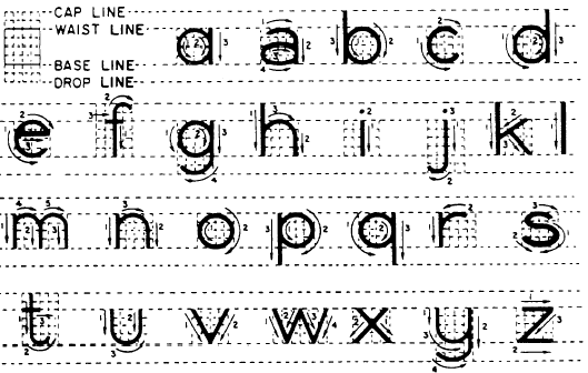
Figure 3-50.-Vertical fractions. The bottom ellipse is two thirds of the height of the figure from the base line.The division bar between the numerator and denominator of the fractions is always drawn parallel to the guidelines, as shown in figure 3-50. The complete height of a fraction is twice that of a whole number. The division bar is centered midway between the base line and cap line. The top guideline of the numerator and the bottom guideline of the denominator are spaced a full number height from the division bar. The numbers composing a fraction are three quarters of the height of a full number. The clear space on either side of the division bar is one quarter of a full number. Numbers in a fraction are centered about a vertical guideline that cuts the fraction bar in half.Lowercase Letters Lowercase letters are never used on construc-tion drawings, although it is acceptable to use them for notes on maps or similar drawings.
Figure 3-51.-Lettering vertical lowercase letters. Lowercase letters should NEVER be used on drawing title blocks. Figure 3-51 shows lowercase letters along with guidelines and strokes used to form each letter.The crosses of f and t are on the waist line and extend the same distance on either side of stroke 1. The horizontal stroke of e is just above midheight. The bodies of a, b, g, p, and q are circular and vertical strokes of these letters do not increase their width at the points of tangency. The vertical strokes of p and q terminate at the drop line. The vertical strokes of g, j, and y terminate in curves that are tangent to the drop line. |
||
|
||