Custom Search
|
|
 
|
||
|
NEWSPAPER DESIGN CONCEPTS LEARNING OBJECTIVE: Detail the design concepts used in ship or station newspaper makeup. Successfully designing a newspaper page encompasses more than experimentation. It is actually a calculated art evidenced by the following five newspaper design concepts: . Balance l Contrast . Rhythm l unity l Harmony BALANCE In the balance concept, the page designer (hereafter referred to as the editor, although it may be any member of the newspaper staff performing this function) tries to balance heads against heads, pictures against pictures, stories against stories and artwork against artwork. This balance, however, is a relative balance, and it is not measurable but is something gauged in the viewer's mind. Therefore, the editor has to sense, rather than measure, the balance for a page. This perception is one
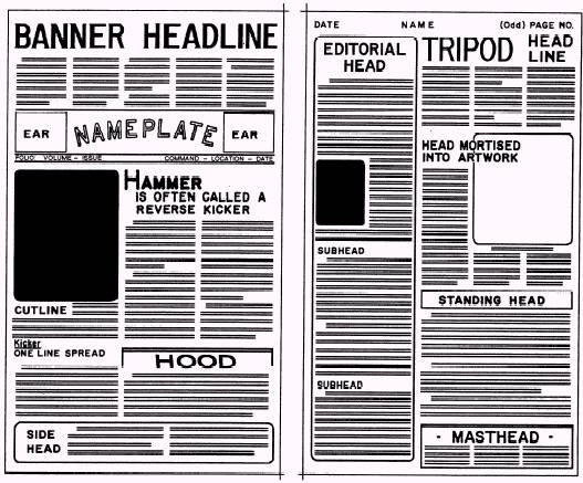
Figure 8-18. - Individual components of newspaper makeup. developed by experience. The editor looks at the page CONTRAST In the contrast concept, the editor strives to separate display items on the page so each gets the attention it deserves. The editor uses type, headlines, pictures, white space and color to achieve contrast. For example, the editor can achieve contrast with type by using regular type with boldface type. Headlines also can be contrasted by using bold, blackheads or by displaying reman type with italic type. The editor can achieve contrast with pictures by using verticals with horizontals, small column widths with large column widths or dark and light photographs. Further, the editor can achieve contrast through color by displaying black type with color boxes, pictures and heads. RHYTHM By using the rhythm concept, the editor tries to get the reader to move from one element to another element on the page. Rhythm is achieved in newspaper makeup by staggering headlines, stories and pictures on the page. UNITY The unity concept of newspaper makeup is used to tie the page together; therefore, the page is not divided into one, two or more sections. A page that lacks unity is called a paneled page. You can avoid paneled pages by crossing the column gutters (space between columns) with headlines and pictures in the middle areas of the page. HARMONY The harmony concept is used to give a newspaper a standard appearance from day to day. Harmony generally refers to typographic harmony. This means using one typeface for body type and a contrasting typeface for cutlines. Headlines should have the same typeface as the body type and maybe varied by weight and the use of italics on occasion.
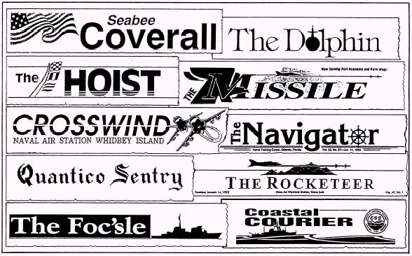
Figure 8-19. - Newspaper nameplates. |
 |
|
|
||