Custom Search
|
|
 
|
||
|
Spacing Between Guidelines The spacing between two lines of capitals may vary from one half of the height to the full height of a capital. Two thirds of the height is customarily used.The spacing commonly used between lines of lowercase letters is shown in figure 3-44. The space indicated by the letter S equals the vertical distance between the waist line and the cap line.VERTICAL SINGLE-STROKE GOTHIC LETTERING The generally accepted style of lettering for SEABEE drawings is the single-stroke Gothic
Figure 3-44.-Spacing between lines of lowercase letters.
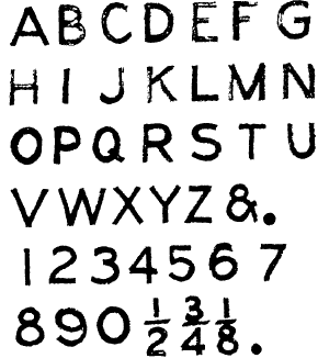
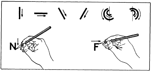
Figure 3-45.-Vertical single-stroke Gothic capitals and numerals.vertical (fig. 3-45) or inclined lettering. The term Gothic refers to the style of letters. Gothic lettering is the simplest style to make and the easiest to read on a drawing. Single-stroke means that each stroke of the letter is made by one stroke of the pencil. Figure 3-46 shows the basic strokes required for single-stroke lettering. Vertical strokes are drawn from the top down with an even finger movement. (Inclined strokes are drawn in the same manner.) Horizontal strokes are drawn from left to right with a complete hand movement, pivoting at the wrist. Curved strokes proceed from above downward, using a combined finger and wrist motion. Lettering strokes are drawn, not sketched. It is important that you use the correct direction and sequence of strokes recommended for each letter.The required shapes of vertical single-stroke Gothic letters and numerals will be shown and discussed in the next several figures and paragraphs. To emphasize the proportions of the letters and numerals, each character is shown in a grid, six units high. The grid serves as a reference for comparing the height of the various characters in proportion to their width as well as locating the individual strokes that compose the characters.
Figure 3-46.-Basic lettering strokes.
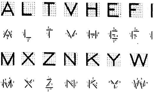
Figure 3-47.-Lettering vertical straight-line capitals. For learning purposes, the characters are grouped by the type of strokes required to form each character. |
||
|
||