|
||
|
|
||
| |||||||||||||||
|
|
MAPS, CHARTS, AND PROJECTIONS To become knowledgeable in geography and plotting, an understanding of maps, charts, and projections is extremely helpful. We will discuss these in the following paragraphs. MAPS A map is a graphic representation of selected features of the Earth's surface, drawn to scale. A map is a compact data base an information storage and retrieval system-that does not require machine action. Instead, the skilled map reader retrieves information from the map. From another viewpoint, maps are twodimensional models of the Earth. Topographic maps are three-dimensional models that show elevation by using contour lines.
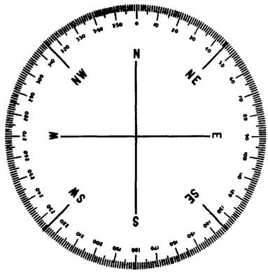
Figure 3-9.-Compass card. The graphic representations on maps may consist of lines and symbols of various colors; drawings of landforms, called physiographic diagrams; or photographs with the addition of lines and colors to emphasize features. CHARTS A chart is a special-purpose map, generally designed for a form of navigation, such as air navigation. There is a difference between charts and maps. Maps show land areas, political subdivisions, and topography. A chart details water areas and has reference lines on it to allow the navigator to graphically plot information. A hydrographic chart provides information such as water depths and locations of navigational aids. An air navigation chart may show land, but it provides the air navigator with elevations as well as the locations of navigational aids. PROJECTIONS A projection is a method of representing a three-dimensional object on a two-dimensional surface. Cartographers (map makers) use projection techniques to build maps or charts; however, it is impossible to project a threedimensional object upon a two-dimensional surface without distortion. The type of projection they use depends on the area to be represented and the use of the map or chart. Distortion cannot be avoided, but it can be controlled. Map makers have created several projections to represent the Earth's surface on a plane. In any projection, they establish a network of lines corresponding to geographic coordinates. This network of lines
Figure 3-10.-A Mercator projection. enables them to place each detail. To use a chart effectively, we must understand the purpose of the projection system and its good and bad features. The Mercator projection, the most common method of making nautical charts, was developed by a Flemish cartographer in the sixteenth century. The Mercator chart is projected by fast placing a cylinder around the Earth, tangent at the Equator. Planes are passed through the meridians and projected to the cylinder upon which they appear as parallel lines of longitude. Lines are drawn from the center of the Earth to the cylinder passing through the parallels to locate the lines of latitude on the cylinder. Then, the cylinder is cut lengthwise and flattened. See figure 3-10.
Figure 3-11.-The difference between a great circle and a rhumb line on the Earth's surface.
Figure 3-12.-Mediterranean Sea. The resulting horizontal and vertical lines form a simple Mercator projection. In the production of today's Mercator charts, parallels are spaced by mathematical formulae. The advantage of a Mercator projection is that it is a conformal chart, showing true angles and true distance. A rhumb line (a line that makes the same angle with all intersected meridians) plots as a straight line on a Mercator chart. See figure 3-11. On a Mercator chart, meridians are parallel. A disadvantage of a Mercator chart is the distortion at high latitudes. At the poles, meridians actually converge; however, they are parallel on the chart. Greenland, in the higher latitudes on a Mercator chart, appears larger than the United States, although it is much smaller. Even in the high latitudes though, the distortion on a Mercator projection does not prevent the measurement of true distance. |
|
Privacy Statement - Press Release - Copyright Information. - Contact Us - Support Integrated Publishing |